
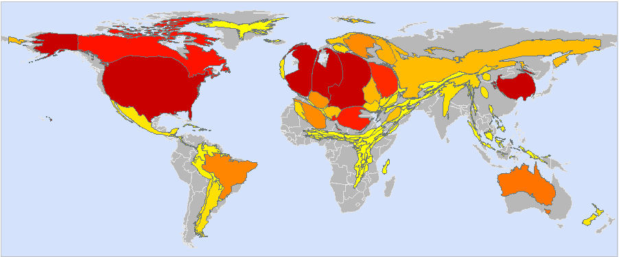
A very rough cartogram of Wikipedia edits by country, from the data on meta :
Disclaimers:
- I really really don’t know what I am doing with cartogram software, so please take this with a huge grain of salt.
- There was no country for Singapore, so it under-represented.
- I don’t think there was any data for Africa at all, so I’m not sure why it’s even showing!
- Similarly any countries not listed in the data were under-represented. This discriminates against countries with less than 0.1% of the edits (i.e. small countries or countries with only a few editors).
- The data is not massively accurate (only accurate to a tenth of a percent).
- Data is from about a year ago, so things may have changed since (e.g. China, with its on-again-off-again firewalling of Wikipedia was not in this data, but Hong Kong was).
Very nice idea, thank you!
Actually, we’ve had a number of edits from Africa; we just don’t have a critical mass of them so they stick in a Wikipedian’s memory. For example, the anon IP 213.55.64.98 resolves to a location inside Ethiopia, & has made several edits to Ethiopia-related articles.
And don’t forget South Africa, long considered part of the “First World” and possessing a telecom infrastructure equivalent to many non-African countries. While on one hand I’m a little surprised we don’t have some visible Wikipedians from that country, on the other I probably shouldn’t since the white Afrikaaners have little love for the outside world while the black citizens in that country are too busy with other priorities to cross the digital divide.
Geoff
Geoff
I think the scale is:
dark red
light red
dark orange
light orange
yellow
grey
but there is no legend to verify this(hint).
-K
There are at least five variables here: The real area of a country, the real population of a country, the Wikipedia activity from the country, the displayed area of a country, and the color displayed on the country. How are they connected?
The real area of Sweden and Japan are roughly the same, but Japan has 20 times higher population. The displayed size of both countries is roughly the same on this map, both somewhat larger than the grey “real” size. Japan is dark red, Sweden is orange.
Norway has roughly half the population of Sweden, roughly half the Wikipedia activity, so activity per capita is about the same in both countries. But in this diagram Norway is light orange and not as much enlarged (over the grey “real” size).
Where is the legend to the map’s colors? Are countries enlarged in proportion to Wikipedia activity per capita, or overall Wikipedia activity?
Hello ! I’m wondering which software you used to produce this cartogram. I think it could be useful for some WP articles, but I can’t find any fre software for it…
To make the cartogram, I did the following steps, using mapresso:
* Open http://www.mypage.bluewin.ch/aj/wmaps/world_test3p.html
* Go Data -> Enter Data -> Paste in the data below, leave the standard settings enabled (“Reset class breaks”) -> click Ok. Observe some colours change in a way that seems to indicate something just happened.
* Go Geometry -> Area Cartogram -> under weight chose “Wikipedia-Edits” -> click Ok.
* Go Geometry -> start cartogram. Nothing seems to change.
* In the toolbar I click the “Do many steps” transform button. It doesn’t do anything.
* Go Geometry -> start cartogram. This seems to make the image change.
* Go Geometry -> start cartogram. Sometimes this seems to make the image change again. So repeat this step around 30 times to maximize the distortion of the image.
Raw data:
———————-
Wikipedia-Edits
1
1000
1
500
1
5700
1
1
1
1
400
1
1
1
1
1
1
1
26800
700
1
1
200
1
1
1
1
1
1
1
1
1
1
1
1
1
1
1
1
1
1
1
1
1
1
1
1
500
1
1
1
1
1
400
500
1
1
1
1
1
7900
1
400
1
1
1800
400
1
1
400
3700
1
1
1
1
1
1
1900
1
1
1
1
1
1
1
600
1
1
1
1
1
1
1
1
1
1
1
1
1
400
1
1
1
1
1
1
1
1
100
1
1
1
1
1
1
1
1
1
1
1
200
2000
1
2300
1
600
9700
3500
6100
1200
700
1
1
1
500
1
1
1000
1
1
1
1
1
1
1
1
1
1
1
1
1
200
1
1
1
1
1
1
1
3900
1100
900
1300
1900
———————-
and the key for which country each of those columns represents is:
> ID;Name
> 1;Luxembourg
> 2;Switzerland
> 3;France
> 4;Republic of Korea
> 5;Cyprus
> 6;Japan
> 7;Bhutan
> 8;Western Sahara
> 9;Qatar
> 10;United Arab Emirates
> 11;Taiwan Province of China
> 12;Mali
> 13;Oman
> 14;Niger
> 15;Chad
> 16;Viet Nam
> 17;Cuba
> 18;Lao People’s Democratic Republic
> 19;United States
> 20;China
> 21;Haiti
> 22;Dominican Republic
> 23;Philippines
> 24;Puerto Rico
> 25;Jamaica
> 26;Burkina Faso
> 27;Nicaragua
> 28;Cambodia
> 29;Costa Rica
> 30;Central African Republic
> 31;Sierra Leone
> 32;Sri Lanka
> 33;Panama
> 34;Guyana
> 35;Liberia
> 36;Democratic Republic of the Congo
> 37;United Republic of Tanzania
> 38;Rwanda
> 39;Burundi
> 40;Andorra
> 41;Zambia
> 42;Malawi
> 43;Bolivia
> 44;Mozambique
> 45;Madagascar
> 46;Zimbabwe
> 47;Namibia
> 48;Chile
> 49;Botswana
> 50;Paraguay
> 51;South Africa
> 52;Swaziland
> 53;Lesotho
> 54;New Zealand
> 55;Argentina
> 56;Iceland
> 57;Estonia
> 58;Latvia
> 59;Lithuania
> 60;Belarus
> 61;United Kingdom
> 62;Kazakhstan
> 63;Ireland
> 64;Ukraine
> 65;Mongolia
> 66;Belgium
> 67;Slovakia
> 68;Hungary
> 69;Republic of Moldova
> 70;Romania
> 71;Italy
> 72;Slovenia
> 73;Croatia
> 74;Yugoslavia
> 75;Uzbekistan
> 76;Bosnia and Herzegovina
> 77;Bulgaria
> 78;Spain
> 79;Georgia
> 80;Prob.
> 81;Kyrgyzstan
> 82;Democratic People’s Republic of Korea
> 83;Turkmenistan
> 84;Albania
> 85;The former Yugoslav Republic of Macedonia
> 86;Portugal
> 87;Turkey
> 88;Azerbaijan
> 89;Greece
> 90;Armenia
> 91;Tajikistan
> 92;Iran (Islamic Republic of)
> 93;Afghanistan
> 94;Iraq
> 95;Syrian Arab Republic
> 96;Tunisia
> 97;Algeria
> 98;Morocco
> 99;Lebanon
> 100;Mexico
> 101;Kuwait
> 102;Myanmar
> 103;Bangladesh
> 104;Thailand
> 105;Belize
> 106;Guatemala
> 107;Honduras
> 108;El Salvador
> 109;Colombia
> 110;Benin
> 111;Ghana
> 112;Togo
> 113;Cote d’Ivoire
> 114;Malaysia
> 115;Suriname
> 116;French Guiana
> 117;Congo
> 118;Gabon
> 119;Equatorial Guinea
> 120;Ecuador
> 121;Peru
> 122;Brazil
> 123;Papua New Guinea
> 124;Australia
> 125;Uruguay
> 126;Denmark
> 127;Germany
> 128;Poland
> 129;Netherlands
> 130;Czech Republic
> 131;Austria
> 132;Nigeria
> 133;Cameroon
> 134;Pakistan
> 135;India
> 136;Jordan
> 137;Libyan Arab Jamahiriya
> 138;Israel
> 139;Saudi Arabia
> 140;Egypt
> 141;Nepal
> 142;Mauritania
> 143;Sudan
> 144;Yemen
> 145;Eritrea
> 146;Senegal
> 147;Ethiopia
> 148;Gambia
> 149;Djibouti
> 150;Guinea-Bissau
> 151;Guinea
> 152;Venezuela
> 153;Somalia
> 154;Trinidad and Tobago
> 155;Brunei Darussalam
> 156;Kenya
> 157;Uganda
> 158;Indonesia
> 159;Greenland
> 160;Canada
> 161;Russian Federation
> 162;Norway
> 163;Finland
> 164;Sweden
… and the person who helped point me in the right direction and who knows what they’re talking about in this area is Adrian Herzog of http://www.mapresso.com – so any further queries would be best directed towards Adrian ;-)
— All the best,
Nick.
Re: http://blog.nickj.org/2007/08/30/rough-cartogram-of-wikipedia-edits-by-country/#comment-136
> There are at least five variables here: …. How are they connected?
Really don’t know – sorry! Best thing is to ask the mapresso folks ( http://www.mapresso.com/ ) – I just liked the resulting picture ;-)
Re: http://blog.nickj.org/2007/08/30/rough-cartogram-of-wikipedia-edits-by-country/#comment-135
> I think the scale is:
> dark red
> light red
> dark orange
> light orange
> yellow
Correct.
> grey
The grey is just for the background image I think, more like a “control group”.
The mapresso folks are just me.
Conceptionally, there are two steps: (1) you create a cartogram by entering an absolute variable: the bigger the number, the bigger the area of the country will be at the end of the iterations. (2) you choose a relative variable (as population growth in %, income per capita etc.) to color the countries. As I see the example, the colors show also the absolute variable (population), which is not correct because this way the size of the population is expressed in a double sense (size and darkness; btw. the sequence is yellow-orange-red-dark red).
Adrian
See also here: Your Wikipedia Cartogram: Creative Commons and Sources?
Hi Frakturfreund, Have replied to query on my wiki page + emailed the requested excel file. Cheers, Nick.
Pingback: A different view of the World « The Blog by Javier
is made by MAPresso, and the quickest explanation on how to work with it I found it in this